In the world of consumer goods, few packaging designs carry as much weight and controversy as the cigarette box. What appears to be a simple cardboard container actually represents decades of marketing evolution, psychological manipulation, and regulatory battles. The cigarette box serves as the final point of contact between manufacturer and consumer, making its design crucial in a market where traditional advertising faces increasing restrictions.
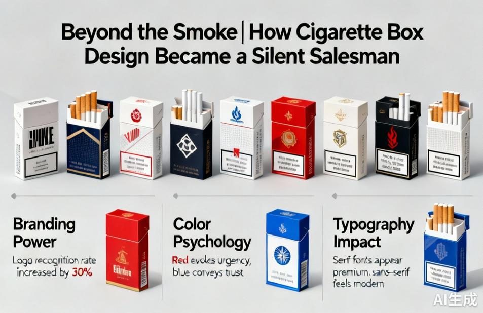
The history of cigarette packaging reveals a fascinating journey from simple functionality to sophisticated branding. Early cigarette boxes were merely practical containers—simple paper wrappers or metal tins designed to preserve freshness. However, as tobacco companies recognized the power of branding, packaging transformed into a canvas for corporate identity. The iconic Marlboro red chevron, the elegant gold accents on Benson & Hedges, and the distinctive camel illustration became more than just decorations—they embodied lifestyle aspirations and personality traits that manufacturers wanted to associate with their products.
Color psychology plays a pivotal role in cigarette box design. Premium brands often employ gold, silver, and deep blues to convey luxury and sophistication, while lighter brands might use white and pastel shades to suggest mildness or purity. The specific hue of red on a Marlboro box isn’t accidental—it’s carefully calibrated to evoke feelings of strength and tradition. Even the texture of the paper and the quality of the printing contribute to the perceived value of the product inside.
In recent decades, governments worldwide have transformed cigarette packaging from a marketing tool into a public health messenger. Plain packaging laws, first implemented in Australia in 2012, have removed branding elements and mandated graphic health warnings covering up to 75% of the package surface. This regulatory shift has created a fascinating design challenge: how to maintain brand recognition when stripped of traditional branding elements. Some companies have responded with subtle variations in package shape or opening mechanisms, while others have focused on the tactile experience of holding the box.
The psychology behind cigarette box design extends to how smokers interact with their packs. The ritual of tapping a fresh pack, the satisfying flip of the lid, and the careful arrangement of cigarettes within all contribute to the smoking experience. Designers understand these behavioral patterns and create packaging that enhances these rituals. The click of a hard box closure or the smooth slide of a soft pack sleeve are deliberate design choices that reinforce brand identity through sensory experience.
As we look toward the future, cigarette packaging continues to evolve in response to changing consumer preferences and regulatory landscapes. The rise of reduced-risk products like e-cigarettes and heated tobacco has introduced entirely new packaging paradigms—sleek, tech-inspired designs that distance themselves from traditional cigarette imagery. Meanwhile, sustainability concerns are pushing manufacturers to reconsider materials and production processes, with some exploring biodegradable or recyclable alternatives to conventional packaging.
The cigarette box stands as a testament to the power of packaging design—a silent salesman that communicates values, builds loyalty, and navigates complex regulatory environments. While the tobacco industry faces unique challenges, the lessons from cigarette packaging apply across consumer goods: effective design doesn’t just contain a product; it tells a story, creates an experience, and forges an emotional connection that transcends the physical object itself.


Leave a Message